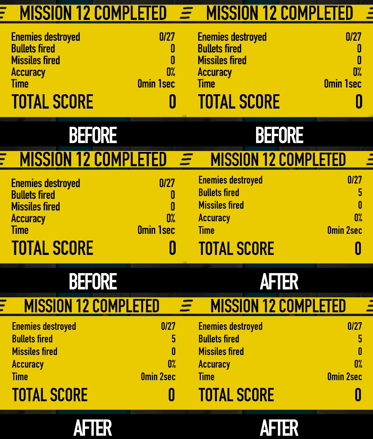
In the upcoming Superforce 1.1 update I stopped using stb_truetype and went back to pre-rendered fonts made with Glyph Designer.

Before & after switching away from STB Truetype
Unfortunately I had some problems with stb_truetype which I wasn’t able to solve. Some characters from some fonts were cut off on the left and sometimes on top a bit, with no reasonable explanation. Also the glyph shapes in general did not have the right amount of sharpness and smoothness I wanted. Perhaps I’m too used to Mac OS X font rendering? Who knows.
I’m sure most people can use stb_truetype properly and I still have high regard for it (and anything that @nothings produces for that matter) but it seems like this one was not meant for me. I’d still like to finish my own font converter someday.